Showing posts with label evaluation questions. Show all posts

Monday, 28 March 2011

Eval. question 7: Music magazine

7. Looking back at your preliminary task, what have you learnt in the progression from it to the full product?


When i first began this AS Media coursework, i had never used any of the programmes before. Our first task was to create a front cover and contents page for a school magazine. The preliminary task was really when i explored the softwares, slowly becoming more confident in using them. My front cover for my school magazine does not seem to have the same quality as my music magazine, which i did more research for. It follows a very basic structure, mostly sticking to the rule of thirds. It is clear to see that i didn't experiment much with my school magazine front cover as the colour, and size of the font is mostly the same throughout the entire page. I didn't edit the image much at all, only brightening it a little. The only thing that i experimented with a lot on my first task was the font for the school magazine title, "The Taversham Titbit". I used a drop shadow, and tampered with different colours and effects until i was pleased with the end result. The logo has been edited using the "Clipping Tool", but as i was not used to the programme, i was not aware that the tolerance of this tool could be tampered with, so that the little white edges remaining would disappear. Due to my lack of understanding where Photoshop and InDesign were concerned, i could not do much to my photographs as i did not fully understand the software, and so i was not confident with using it. When looking at my music magazine front cover in comparison to my school magazine front cover, it is clear that i was a lot more confident using the software, and not afraid to experiment more with different tools and features that i had not used before, like the paintbrush and the ink dropper tools, which i used to edit the edge of the ukelele, which was lost because of the lighting. I used more colours and different font sizes, adding more features to my magazine, like the barcode and price. I also feel as though the photograph, although not great, has increased in quality in comparison. My music magazine also seems to follow my research a considerable amount more than my school magazine does.

The contents page of my preliminary task is of a better quality than my school front cover, in my opinion, as i used more colour, pulling it from the image. The structure of the overall page is a lot more obvious than my front cover, and it looks more professional in comparison. I feel that the coloured lines add a needed break from the text, and that the use of different font sizes and colours for the titles and subheadings is a good feature. The photograph that i have used does not show a great difference in terms of quality, to my front cover image. In contrast, the contents page for my music magazine differs from my school one considerably. When taking my photographs for my music magazine, i had access to lighting equipment, and so i could control the lighting more than i could for my school photographs, which were taken outside. The structure of both contents pages are roughly the same, but because of the different tasks, each layout has many major differences. The music magazine allowed me to experiment more with colour and different fonts, which i couldn't do with my school magazine. By the time i was making my music magazine contents page, i was able to crop images in different shapes, rotate images and text, and change the display performance of my photographs. I also knew how to use tools like, "Clipping Path", "Dodge Tool" and "Magic Wand", which helped to increase the quality of my work considerably. I was able to make my magazine for my target audience with more ease because of this. I did not do nearly as much research for my school magazine as i did for my music magazine, which helped me to refine my magazine so that it would appeal to my target audience more. Furthermore, i do not think that i was as focused for my school magazine like i was for my music magazine, which can be seen in the difference in quality of both.

Overall, looking back at my preliminary task in comparison to my music magazine, i can say that i feel i have progressed in not only my organisational skills, which have been improved by the use of this blog, but that i have gained many skills, such as the ability to use software such as Photoshop and InDesign. I understand much more about technology, and different items that can help me improve my research and final products, such as microphones, and Windows Movie Maker. I have realised what is needed to make a good quality magazine that will be successful with sales, and how to target it at a certain social group to ensure that they will like the content. When i started my preliminary task, i was not aware of all the different parts that were needed to make a successful magazine, or how to use that information. Furthermore, when i first began the course i was not as experimentive as i am now, and that can be seen in my initial products, as it was very much trial and error due to my lack of knowledge on the software i was using.

Eval. question 6: Music magazine

http://www.youtube.com/watch?v=ANnUxCIvcWM

I have created a powerpoint in a video to show my evaluation question. The URL has also been provided to prevent any viewing problems.

Eval. question 5: Music magazine

5. How did it attract/address your audience?

As my music magazine was aimed towards mainly girls, as well as boys, i tried to keep the balance between the features, in an attempt to ensure it was not predominantly focused towards girls. Additionally, as my magazine was aimed towards those that enjoy different types of indie music, i had to offer enough of that to make sure that it was popular with that social group, as well as including a few other things that could help to appeal to those that only enjoy that particular music slightly, finding more interest in a few mainstream bands, which is why i included a few of those.

Front Cover

Contents Page  

Double Page Spread

Eval. question 4: Music magazine


Here is a video i created to show my evaluation question 4. The link has also been provided to prevent any viewing problems. Once the video has started, click it so it can take you to the Youtube website, and put it on full screen to make reading my research easier.

Eval. question 3: Music magazine

3. What kind of media institution might distribute your media product and why?

When thinking of magazines similar to my own that i have previously researched, i looked at who published Company magazine, and found that it was a company called Nat Mags (short for National Magazine Company), who were also associated with Seventeen magazine. As Company follows a fairly similar theme to my own, using many of the same features, i thought that this would be a good choice for a magazine that would be suitable to distribute my own music magazine. After i researched into the company further, i noticed that many of the other magazines that it published were aimed towards a much older target audience, such as Cosmopolitan and Reveal. Although this is a popular and wealthy company, their experience may be mainly with magazines aimed towards the older generation, and so they are not the best company for me, as they may not have the experience with magazines aimed towards the younger generation.

After realising that this would not be the best organisation for me to use, i continued my research, looking into who distributed Sugar magazine. I found that it was distributed by a fairly well known company called, Hachette Filipacchi (UK) Ltd, which is one of the many parts of the largest magazine publisher in the world, Hachette Filipacchi Médias. The UK part of this company is not that well known, but seems to be experienced in magazines for a younger target audience, and as the entire organisation itself is incredibly wealthy, they could provide my magazine with money to fund it, as well as help because of the experience it has gained from Sugar. This is why i believe Hachette Filipacchi (UK) to be the best choice for a media institution that could distribute my media product.

Eval. question 2: Music magazine

2. How does your media product represent particular social groups?

My music magazine is supposed to be aimed towards mainly girls, but boys as well, that enjoy different types of indie music, such as indie-rock, alternative-rock, and indie-pop, among other things. I added features, such as festivals like Reading and Leeds, which cater to this type of music more than any other, as well as advertising artists and bands that produce this genre of music. I looked at Independent music as a whole, and then researched into the different types, mostly indie-rock and pop.

In music, independent music, often shortened to indie music or "indie", is a term used to describe independence from major commercial record labels, and a Do-It-Yourself approach to recording and publishing. Independent labels have a long history of promoting developments in popular music, stretching back to the post-war period in the United States, with labels such as Sun Records, King Records, Stax. In the United Kingdom during the 1950s and 1960s, the major record companies had so much power that independent labels struggled to become established. Several British producers and artists launched independent labels as outlets for their work and artists they liked, but the majority failed as commercial ventures, or were swallowed up by the majors. During the punk rock era, the number of independent labels grew. The UK Indie Chart was first compiled in 1980, and independent distribution became better organized from the late 1970s onwards. Indie rock is a sub-genre of alternative rock that originated in the United Kingdom and the United States in the 1980s. The meaning of the term "indie rock" is contested today by many musicians, fans and commentators. Most use the term "indie" to describe any rock music produced by artists working within the network of independent record labels and underground music venues that emerged in the United States and elsewhere in 1980s and 1990s. Others see indie rock as a distinct genre of rock music with a specific artistic aesthetic, and care less about the context in which it is made. Many embrace both meanings of the word, believing that the aesthetics of the genre and its means of production are deeply intertwined. Popular indie-rock bands that have prospered from being signed to major labels would be, LCD Soundsystem, who i mentioned on my front cover, Vampire Weekend, The Black Keys, Interpol, The Wombats, and The National. Indie pop is a genre of alternative rock music that originated in the United Kingdom in the mid 1980s, with its roots in the Scottish post-punk bands on the Postcard Records label in the early '80s, such as Orange Juice, Josef K and Aztec Camera, and the dominant UK independent band of the mid eighties, The Smiths. Unlike Indie rock, Indie pop is more melodic, less noisy, and relatively angst-free. Some examples of popular indie-pop artists that my target audience would recognise are:
  • Kate Nash
  • Black Kids
  • Two Door Cinema Club
  • Death Cab for Cutie
  • Ellie Goulding
  • Florence and the Machine
  • We Are Scientists
After i researched independent music in depth, i decided on what my artist would have to look like if she were to represent that particular genre. I looked at the usual clothing that would be associated with that label, and researched into what particular favourites there were.

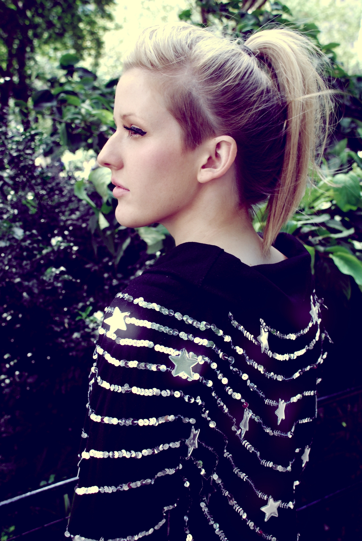
When looking at Ellie Goulding, who is a very popular singer currently dominating the charts, i realised that bright, occasionally eye-catching clothing was customary, but not in an overbearing style. Stars and objects associated with nature were common on clothing, like floral prints, or space-related things, like stars or planets. This gave me the idea to dress my model in something similar, and so i asked her to wear her star print dress, which is featured on my music magazine front cover.

Florence Welch from Florence and the Machine's dress is a good example as well. Here she is wearing a dress printed with the faces of band members, which is common clothing for those that produce this genre of music, or those that follow the same style as they identify with it. Festival, gig, or artist shirts are very common, which is why asked my model to wear her Reading Festival shirt in my contents and double page spread images. Images of older bands from the 70's and 80's are usually seen, as those that enjoy indie music often enjoy music from older generations as well.

 
I also noticed that those that dressed in this particular way frequently adopted certain items of clothing from other genres, such as punk-pop, and punk-rock, choosing to wear things like Doc Martens and darker makeup, and mixing it with what they considered indie clothing, such as items from charity stores that followed the usual style, such as floral print, patterned tights, and items with lace attached, preferring to add a more feminine touch to their clothing. My model wore her classic black Doc Martens, with a girly pale blue denim skirt,
paired with dark purple tights, and a festival shirt, merging all of these personal style choices that are associated with this particular genre together. I feel as though my model manages to successfully portray this social group in my target audience, as she is only 17, and so only a year older than the oldest age in my target audience. As she does not look particularly old, i believe that her age makes little difference to the overall effect. I believe that as my model is a similar age to my target audience, and dresses in a fairly similar way, that this would appeal to my target audience because they would be able to relate to her. The attitude that accompanies this social group is quite light-hearted and fun personality, as they are often quite carefree, and i feel that this has been shown clearly in my photographs.

Sunday, 27 March 2011

Eval. question 1: Music magazine


Here is a video that i created on Windows Live Movie Maker, which i uploaded to Youtube. The link has also been provided to prevent any viewing problems. If you wish to see the text more clearly, please start the video, click it, which will take you to the actual Youtube site. Please then change it to full screen.

Wednesday, 24 November 2010

Preliminary task: Eval. questions

1. In what ways does your media product use, develop or challenge forms and conventions of real media products?
As i have used a normal idea for my school magazine name, which is to use the schools name itself, and add something extra, i have stuck to the norm where it is concerned. I have placed a logo on the front page, which would commonly be seen on a school magazine, as it would help the reader identify what school it was made for. I used features like an issue number, and date. I also included various events as advertisements for what would be within the magazine. The photograph i used was a typical choice for a school magazine, as it shows two students studying. The contents page also follows the norms and conventions of a school magazine, as it has an image of students working, with the text placed around it, with a plain background that will not distract the reader from the content. The name of the school has been included at the top of the contents page as well, which is a common feature.


2. How does your media product represent particular social group?
My school magazine photographs represent the average school student, which would be associated with homework, and school uniform, which is why they has been included on my own images. The image features 6th Form students wearing the typical black suit that would be required in most schools, and so i feel that they would be the most likely to read my magazine. I also think that their parents would probably read the magazine as well, as it features articles on charity events, interviews with new teachers, and information on the upcoming parents evening.

3. What kind of media institution might distribute your media product and why?
As it is a standard school magazine, the funds to produce would probably be quite low, as obviously, it is only for one particular school, and so no one else can benefit from it. This is the reason why i would say the magazine would be distributed by the school itself, as they would know what can and can't be included, and have access to information about the school, that could help with the magazines development. They would also be able to keep control of the distribution, resolving any problems that may arise because of the access they would have to it.


4. Who would be the audience of your media product?
The target audience of my school magazine would be the 6th Form students themselves, as well as their parents, and most likely, the staff at the school itself. I don't think that the younger students would find much interest in the magazine, as the contents is mainly geared towards those in the upper end of school. Some students in year 10 and 11 may also read my school magazine, as it would involve information on higher education, which would be something they would need to research themselves.

5. How did it attract/address your audience?
I think i attracted and addressed my audience by including photographs of people they could relate to. Older students would be interested in the magazine because it would feature people that they study with, while younger students may read it because they respect older students or want to gather some information on the school. Parents would be attracted to the magazine as it features many articles on things that they would often be involved in, like parents evening, pamper evenings, and open day dates, and the school calender.

6. What have you learnt about technologies from the process of constructiong this product?
Since the beginning of the course, i have not had much time to investigate many other types of software, but the main ones that i have recently learned how to use, and am slowly becoming more confident with, would be Adobe Photoshop CS4, and Adobe InDesign CS4. Photoshop allowed me to edit my photographs, by changing the brightness/contrast of them, and cropping the image to change its size, as well as enabling me to remove any blemishes on the models faces. InDesign allowed me to create different types of text, using different fonts, colours, effects, and sizes, which meant that i could experiment slightly when creating my school magazine title.